

Your metrics are fine - you just need to fix your storytelling
How data storytelling can fix the communication crisis.

👋 Hey, it’s Stephane. I share lessons, and stories from my journey to help you lead with confidence as an Engineering Manager. To accelerate your growth see: 50 Notion Templates | The EM’s Field Guide | CodeCrafters | Get Hired as an EM | 1:1 Coaching
Paid subscribers get 50 Notion Templates, The EM’s Field Guide, and access to the complete archive. Subscribe now.

You spent three hours preparing charts showing decreased cycle time, improved deployment frequency, and reduced error rates. Your senior stakeholders nodded politely, asked zero follow-up questions, and approved exactly none of your resource requests.
It is not a data problem, it’s how you present it.
Brilliant engineering teams get their budgets slashed because they can’t translate “reduced P95 latency from 450ms to 180ms” into anything meaningful to leadership.
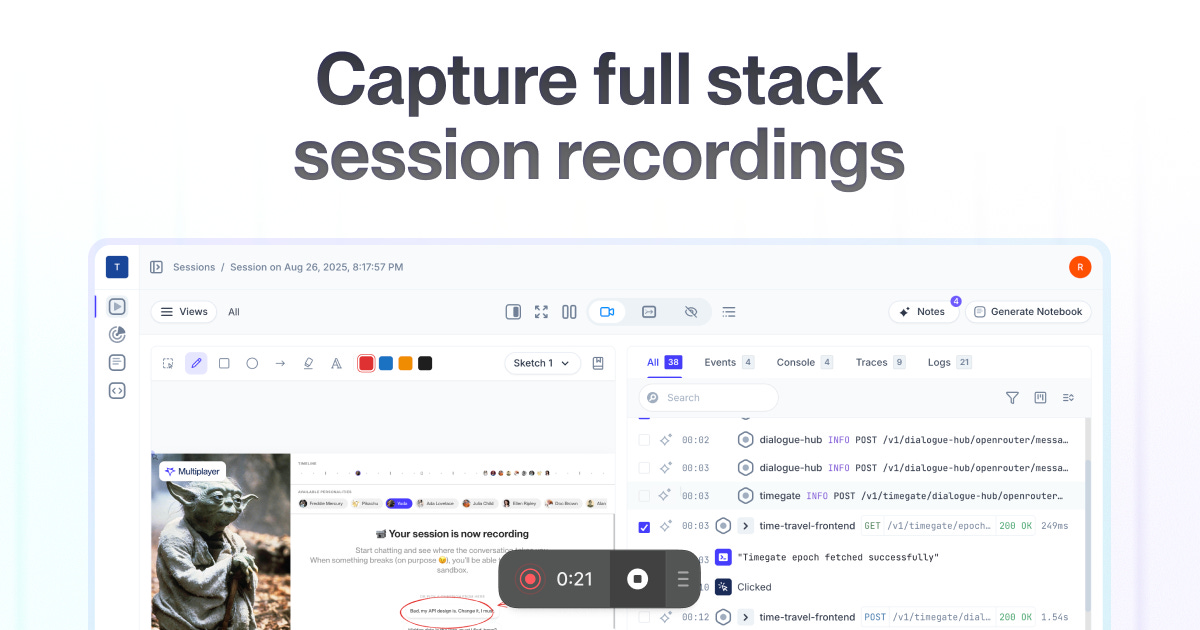
Debugging complex systems doesn’t have to take hours. Multiplayer gives engineering teams full-stack session recordings (frontend, backend, logs, and metrics) all in one place so you can fix issues faster. Explore the sandbox today! try it free for 1 month here.
Thanks to Multiplayer for sponsoring this newsletter!
Your audience doesn’t care about your beautiful dashboards
You’ve built gorgeous Grafana dashboards with 47 different metrics and color-coded heat maps. Your team loves them.
What is the story they tell you though?
Cole Nussbaumer Knaflic (ex-Google People Analytics Manager and author of Storytelling with data) has created many frameworks for that. When adapted for engineering contexts, it can transform technical metrics into compelling narratives that actually drive decisions. But most engineering leaders skip the most important step: understanding their audience.
Your CTO doesn’t need to know how floor frequencies are calculated, they need to know why that calculation protects customer trust and competitive advantage.
In one of the companies I worked with we used to do quarterly planning meetings. That was a meeting that execs joined and I was stressing about it. I prepared a lot and presented exhaustive performance metrics to executives who wanted one thing: confidence that engineering could deliver business objectives. My detailed technical analysis convinced no one because I answered questions they weren’t asking.
Context
Your audience can vary dramatically in technical literacy and decision-making authority. For instance, your incident postmortem needs three different versions:
Engineering: Root cause analysis, technical implementation details, prevention strategies
Product managers: User impact, timeline, and requirements for the follow-up fixes
Executives: Business impact, customer communication strategy, competitive implications
Same incident. Three completely different stories. Each equally accurate, but each emphasising what that specific audience needs to make informed decisions.
Stop drowning stakeholders in technical details
You dive into implementation specifics when stakeholders need strategic insights. This single mistake destroys more engineering credibility than actual technical failures.
Here’s what happened when I finally learned this lesson: Instead of explaining how we optimised database queries, I presented it as “Engineering improvements delivered 60% faster customer experience, reducing support tickets by 23% and protecting $340K annual revenue from churn”. Same technical work. Completely different stakeholder response.
Now don’t get me wrong, this information is not easy to get and it’ll take you time. But it’s so worth it!
Remove technical jargon for business audiences. “Reduced mean time to recovery” can become “faster problem resolution protecting customer trust”.
Eliminate redundant metrics. Show cycle time OR lead time, not both, unless you’re specifically comparing them.
Focus on decisions. Your architecture review should highlight the business case and resource requirements, not exhaustive technical specifications.
Choose visuals that match your story
Data requires specific visualisation approaches that differ from standard business reporting.
You need line charts for velocity trends for easier pattern recognition. Burndown charts show sprint progress against goals. Heat maps can show code quality across system modules. Each engineering metric has an optimal visual representation that maximises understanding while minimising cognitive load.
Cycle time metrics: Histograms or box plots showing development stage analysis
Error rates: Time series with alert thresholds clearly marked
System performance: Real-time dashboards with gauge charts for SLA tracking
Technical debt: Heat maps for module-level quality combined with stacked bar charts showing debt categories over time
Three tools to help you
You need platforms that translate technical metrics into business narratives. Three stand out for different needs.
Note: I am not sponsored by any of these companies.
Grafana for engineering storytelling
Grafana’s 150+ data source integrations provide pre-built dashboard templates specifically for engineering metrics. DORA metrics dashboards with GitHub/Jira integration deliver immediate value while supporting custom KPI tracking for organisation-specific needs.

You can implement DORA metrics as a starting point and customise dashboards for team-specific views. The cycle time analysis with development stage breakdowns can provide particularly valuable insights for sprint retrospectives.
DataDog for exec reporting
DataDog’s Software Delivery insights feature built-in DORA metrics alongside APM integration for performance correlation. Engineering Reports automatically generate reliability and velocity narratives while Developer Overview pages track individual productivity within team context.

LinearB for automated intelligence workflows
LinearB’s automated data collection from Git and project management tools eliminates manual metric gathering. Investment allocation tracking shows feature vs. maintenance vs. debt ratios that directly support resource planning discussions.

Speak three languages fluently: C-suite, product, and engineering
You need to present the same data differently to various stakeholder groups. Each adaptation emphasises different aspects while maintaining factual accuracy.
C-suite execs: Business impact in under 10 minutes
Executive communication requires immediate business relevance with minimal technical detail. Use the AIDA framework (Attention, Interest, Desire, Action): start with business-critical metrics, connect to strategic goals, show competitive advantage or cost savings, then present clear resource requirements.
Examples:
“Deployment frequency increased 40%” becomes “We respond to market demands 40% faster”
“Lead time for changes reduced by 9 days” becomes “New features reach customers 9 days sooner”
“MTTR improved to 15 minutes” becomes “99.9% uptime maintains customer trust”
Product Managers: Feature impact and timeline clarity
Product manager communication mixes technical and business concerns. Use the “What/So What/Now What” framework: current technical situation, impact on product roadmap, collaborative next steps needed.
Specify available story points (if you use them), technical debt allocation percentages, dependency risks with buffer requirements, and confidence levels for different features. When explaining technical constraints, provide multiple solution options: quick fixes with limitations, optimal solutions with longer timelines, and compromise approaches balancing both needs.
Engineering peers: Technical precision with full context
Communication to other engineers requires maximum technical detail. Architecture Decision Records (ADRs) provide structured templates documenting context, decision, consequences, and mitigation strategies.
Include comprehensive summaries, clear motivation, detailed design with specifications and diagrams, phased implementation plans, and specific questions for discussion. The goal: enable other teams to understand, integrate with, and build upon your technical decisions.
Start with your next presentation
Don’t wait for perfect conditions to begin improving your data storytelling. You can implement these changes immediately:
Before your next stakeholder presentation: Identify your specific audience, their decision-making authority, and their primary concerns. Translate every technical metric into their language. Remove any metric that doesn’t directly relate to your core message.
This week: Pick one recurring report and redesign it using the audience-specific frameworks above. Measure stakeholder engagement and follow-up questions as proxies for communication effectiveness.
This month: Choose one visualisation tool that fits your organisation’s needs and technical stack. Implement standardised dashboard templates that translate engineering metrics into stakeholder language automatically.
Your metrics are probably excellent. Your story needs work. Fix the story, and watch everything else fall into place.
That’s all, folks!
See you in the next one,
~ Stephane
Thanks Stephane. I am still learning.
Storytelling with data is such an important topic! It’s at the heart of nailing your promotion, acing the job interview, and getting buy-in for that passion project.
The key really is to start with them, not you. Your job is to craft a story that will resonate with your audience. And the critical first step is to figure out what they actually care about.
The story and data only come after you know that.